Transform a technical internal document like a Human Concern International (HCI) Completion Report into a donor-facing reporting portal.
You must pivot from "compliance" to "impact."
Donors want to see the human story, the transparency of their funds, and the tangible results of their contribution.
Based on the Gaza project data provided, here is a blueprint for building a high-conversion, modern donor reporting page.
1. The Impact Dashboard (The "At-a-Glance" Section)
Donors often skim. Use a "Hero" section with a high-quality photo from the 20+ photos provided and an immediate statistical breakdown.
Project Title: Emergency Food & Hygiene Support – Gaza.
Implementation Partner: ONSUR.
The "Big Number" Headline: 24,795 Lives Impacted. (Highlight that this exceeded the target of 12,500 by nearly 100%).
Activity Breakdown:
3,000 Flour Packages Distributed.
2,000 Hygiene Kits Distributed.
4,959 Households Supported.
2. Demographic Transparency (The "Who" Section)
Modern donors value inclusivity. Use a simple bar chart or icons to display the demographic breakdown provided in your report:
Group | Reach |
Women | 5,750 |
Men | 5,300 |
Girls | 7,000 |
Boys | 6,745 |
3. The "Inside the Kit" Visual
Donors love to know exactly what their money bought. Create a "What’s Inside" section for the Hygiene Kits using the specific inventory list:
Health Essentials: Shampoo, dishwashing liquid, laundry detergent, and bar soap.
Protection: Alcohol spray sanitizer and sanitary pads.
Personal Care: Toothbrushes, toothpaste, and towels.
4. Narrative & Testimonials (The "Human" Section)
Translate the "Process of Implementation" into a storytelling timeline.
The Challenge: Mention the ongoing crisis, blockade, and displacement in Gaza that made this aid vital.
The Response: Describe how flour and hygiene kits were delivered with "solidarity and dignity" to those with no regular food access.
The Voices: Feature the 3 written testimonials mentioned in your requirements. (e.g., "Beneficiaries reported a significant positive impact on their well-being").
5. Financial Accountability & Integrity
Use the report's "Lessons Learned" and "Consultation" data to build trust.
Fairness Guarantee: Explain that resources were allocated equally and fairly through transparent selection in coordination with local leaders.
Efficiency: Highlight that items were procured at the "best prices" to ensure maximum benefit for needy families.
The Full Report: Provide a button to download a sanitized version of the Final Budget and Expense Summary to show you have nothing to hide.
6. Multimedia Gallery
Integrate the media assets required by the report:
Video Feature: Embed the 1 required project video at the center of the page.
Photo Grid: A scrolling gallery of the 20+ high-quality photos showing the distribution days (May 13–18, 2025).
Technical Features for the Portal
Mobile Responsive: As per your previous requests, ensure this portal uses the same card-based, mobile-friendly design as your Zakat calculator.
Searchable Archive: If you have multiple projects, allow donors to filter by Location (e.g., Gaza) or Theme (e.g., Food Security).
Social Share: Add a "Share this Impact" button so donors can show their friends the results of the project they funded.
AI PROMPT: Lovable
Visual mockup for this donor report
A prompt that focuses on empathy, transparency, and dignity.
Here is a detailed, narrative-driven prompt you can give to an AI image generator (like Midjourney, DALL-E 3, or Leonardo.ai) to create a compelling design concept.
The "Dignity & Impact" Visual Prompt
Style: High-resolution, professional UI/UX design mockup for a nonprofit donor transparency portal. The design must be modern, empathetic, clean, and mobile-responsive. Use a trustworthy, sans-serif typography stack (like Roboto or Montserrat).
Color Palette: Establish a "Trust & Hope" palette: a core deep navy blue (for professionalism and integrity), accented by a hopeful, vibrant success green (used for impact stats), and soft, clean white/light grey (for readability). Optionally, include a subtle, muted terracotta or gold accent to represent the Gaza landscape.
Page Structure & Narrative Flow:
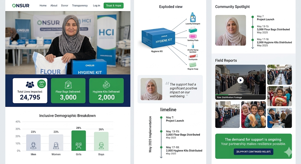
THE HERO (Empathy First): At the top, a striking, full-width photo. The focus must be dignified, not desperate. An older woman in southern Gaza, smiling softly, her hands gently resting on a large white bag labeled "FLOUR" and a blue "HYGIENE KIT." The background is softly blurred but shows an organized distribution point with ONSUR and HCI banners.
THE IMPACT DASHBOARD (Transparency): Immediately below the photo, a clean, navy blue ribbon across the screen containing three key "Success Cards." Each card has a subtle icon and bold, white text:
[Icon: People/Crowd]Total Lives Impacted: 24,795 (with a small "+98% Over Target" badge).[Icon: Sack/Grain]Flour Bags Delivered: 3,000.[Icon: Box/Soap]Hygiene Kits Delivered: 2,000.
THE REACH (Inclusivity Chart): A clean, modern bar chart showing the inclusive demographic breakdown. Instead of raw numbers, use clean percentage bars (approx. 23% Men, 23% Women, 28% Girls, 26% Boys), with gentle icons for each group.
THE KIT VISUAL (Tangible Aid): A stylized, "exploded view" graphic of the blue hygiene kit. Thin lines point from a single box to individual, high-quality illustrations of its contents: laundry detergent, regular tissues, sanitary pads, alcohol spray sanitizer, toothpaste, regular soap, etc. This makes the aid concrete.
THE VOICES (Trust): A "Community Spotlight" card featuring a soft portrait of a beneficiary. A pull-quote in large, italic text: "The support had a significant positive impact on our well-being."
THE TIMELINE (Process): A vertical timeline showing the May 2025 implementation.
May 7: Project Launch.May 13-15: 3,000 Flour Bags Distributed.May 17-18: 2,000 Hygiene Kits Distributed.
THE MULTIMEDIA (Proof): A "Field Reports" grid. The large center tile is a video player (labeled "Raw Distribution Footage"). It is surrounded by a masonry grid of 6 stunning, high-quality field photos showing organized lines, smiling children holding bread, and community coordination.
THE CALL TO ACTION (Continued Partnership): A final, elegant card with a success green background. Text reads: "The demand for support is ongoing. Your partnership makes resilience possible." Below it, a single, modern navy blue button:
[SUPPORT CONTINUED RELIEF].
Overall Vibe: The design must feel like a premium, translucent report that honors the resilience of the community and the generosity of the donor. It is not just about showing what was done, but how it was done—with dignity, coordination, and love.
REFINED PROMPT (reversed prompt derived from image example)
Building a high-impact report portal like the one in your screenshot requires a mix of clean data visualization, emotional storytelling, and a "trust-first" design philosophy.
Here is a step-by-step prompt sequence to help you build this with a developer or an AI coding assistant.
Phase 1: Layout & Core Branding
Goal: Establish the navigation, the hero section, and the high-level impact metrics.
Prompt: "Create a responsive web dashboard for a nonprofit impact report. Use a clean, professional color palette of carmine red (#960018), obsidian black (#0B0D0F), and soft gray backgrounds.
Top Navigation: Include a logo placeholder, links for 'Home', 'About', 'Reports', 'Transparency', and a prominent 'Trust & Hope' button in red.
Hero Section: A two-column layout. Left side features a high-quality image of a beneficiary. Right side displays three key metric cards:
Total Lives Impacted (Big number: 24,795) with a '+98% over target' badge.
Flour Bags Delivered (3,000) with a custom flour icon.
Hygiene Kits Delivered (2,000) with a soap icon.
Use modern typography (like Inter or Montserrat) and rounded corners for all cards."
Phase 2: Data Visualization (Demographics)
Goal: Build the "Inclusive Demographic Breakdown" chart.
Prompt: "Add a 'Demographic Breakdown' section below the hero. Create a horizontal bar chart or a stylized column chart using CSS/SVG.
Data Points: Men (23%), Women (23%), Girls (28%), Boys (26%).
Design Details: Use custom line-art icons for each category. Use a green-to-light-green gradient for the bars. Ensure the Y-axis shows percentages (0% to 40%) and the chart has plenty of white space to look 'airy' and modern."
UPDATES:
Hero image is now full-width at the top
Dark navy strip below with 3 metric cards in a row: white "Total Lives Impacted" card with +98% badge, and two green cards for Flour Bags and Hygiene Kits
Demographic chart updated to "Inclusive Demographic Breakdown" with color-coded bars (gray-blue for Men/Women, dark green for Girls, light green for Boys) and icons inside bars
Glassmorphism + hover effects applied across all card sections
Phase 3: Product Transparency & Timeline
Goal: Replicate the "Exploded View" of the hygiene kit and the project timeline.
Prompt: "Create a 'Product Transparency' section.
Left Column (Exploded View): Display a 3D box labeled 'Hygiene Kit' with lines pointing to individual items: Laundry Detergent, Sanitary Pads, Alcohol Spray, Toothpaste, and Soap. Use small, clean product icons.
Right Column (Timeline): Create a vertical timeline titled 'May 2025 Implementation'. Use green dots for milestones:
May 7: Project Launch.
May 13-15: 3,000 Flour Bags Distributed.
May 17-18: 2,000 Hygiene Kits Distributed.
Middle: Add a testimonial block with a circular headshot and a quote in italics: 'The support had a significant positive impact on our well-being.'"
Phase 4: Multimedia & Social Proof
Goal: Build the "Field Reports" gallery and the call-to-action.
Prompt: "Design a 'Field Reports' grid.
Community Spotlight: Top section with a photo of a community member and a small version of the timeline.
Media Grid: A 4-item grid. The top-left item should be a large 'Raw Distribution Footage' video placeholder with a play button overlay. The other three items should be high-resolution photos of the distribution process.
Footer CTA: A full-width green banner with the text: 'The demand for support is ongoing. Your partnership makes resilience possible.' Add a centered, dark-blue button that says '[SUPPORT CONTINUED RELIEF]'."
Phase 5: Polishing & Responsiveness
Goal: Ensure the portal feels "lovable" and works on mobile.
Prompt: "Review the entire layout. Ensure it is fully mobile-responsive (stacking cards on top of each other for small screens). Add subtle hover effects to the metric cards and the CTA button. Ensure all text is accessible and high-contrast. Add a subtle 'glassmorphism' effect to the white cards to give them depth against the light gray background."
Pro-Tip for Success:
The Greta Master Prompt: "Global Impact Repository"
Role: You are an expert WordPress Developer and Data Architect. Project: Build a public-facing Impact Report Portal for a global nonprofit. Environment: Subdomain [impact.humanconcernusa.org].
The Goal: Transform the static concept of "reports" into a dynamic, searchable, and filterable database. This portal must allow donors and partners to drill down into our global work by region, year, and sector.
Step 1: The Scalable Backend (The "Central Database" Approach)
Custom Post Type (CPT): Create a post type called
Reports.Custom Taxonomies: Build out robust categories for Region/Country, Project Sector (e.g., Food, Health, Education), and Fiscal Year.
Custom Fields (ACF Pro): Architect the backend to store data points:
Core Metrics: Total beneficiaries (integer), budget utilized, and specific items delivered (repeater field for items like "Flour Bags" or "Hygiene Kits").
Demographics: Percentage fields for Men, Women, Girls, and Boys.
The Story: Fields for "Community Testimonial" and "Field Footage" (video URL).
Step 2: Search & Discovery UI
Facetted Filtering: On the main archive page, implement a high-performance filtering sidebar. Users should be able to check "Jordan" and "Food Security" and see all matching reports instantly.
Visual Cards: Each report card should display the main image, the location, and a "Quick Look" at the total lives impacted.
Step 3: The Report Template (Visual Identity)
Palette: Use Deep Red (#960018) for calls to action and primary headers. Use Vibrant Black (#0B0D0F) for background depth and card containers.
Dynamic Data Displays: * A Demographic Bar that pulls from the ACF percentages.
An Exploded View section for "Product Transparency" (showing what goes into a kit).
A Timeline Widget that pulls from a "Project Milestones" repeater field.
Step 4: Integration Ready
Ensure the data is structured so we can eventually ingest data from an external source via the WP REST API to avoid manual entry as we scale.
The Deliverable: Greta, please provide the recommended Plugin Stack (e.g., ACF Pro, WP Grid Builder, or FacetWP), a proposed Data Schema for our fields, and the CSS framework to ensure the Deep Red/Vibrant Black UI feels premium and trustworthy.
Focus on Human-Centric UI. Notice how the screenshot uses real faces and icons rather than just raw spreadsheets. When you implement this, ensure your images have high resolution and consistent lighting to maintain that professional, trustworthy feel.