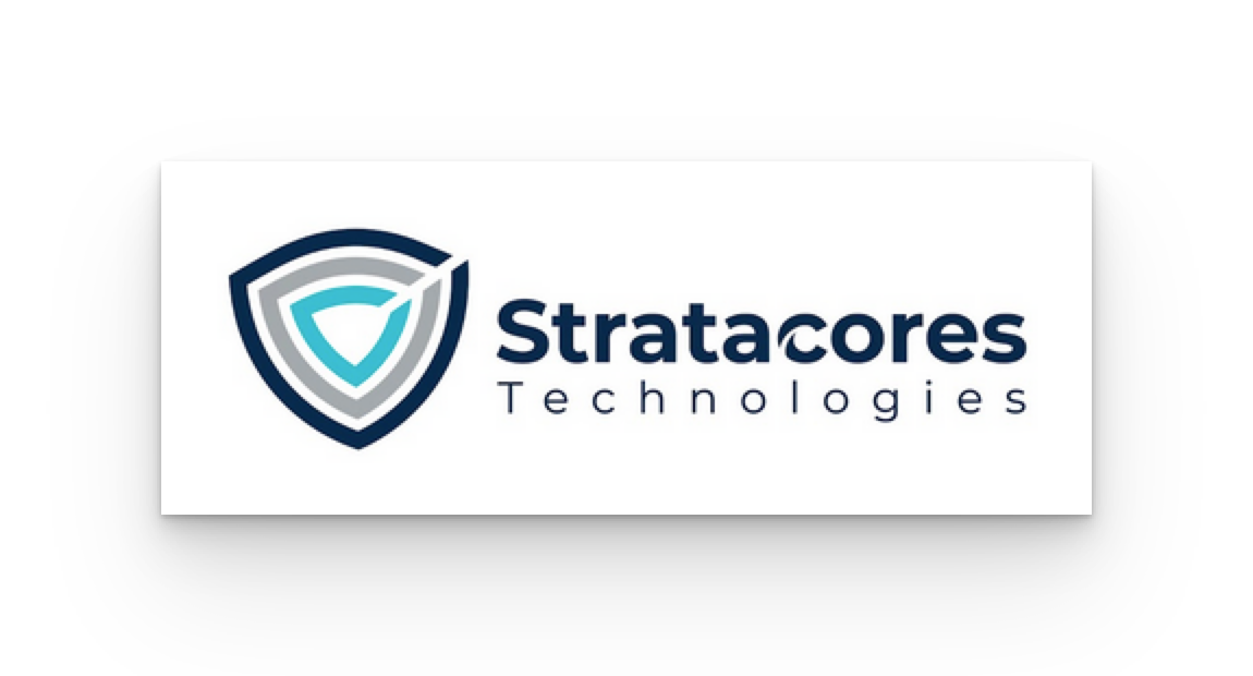
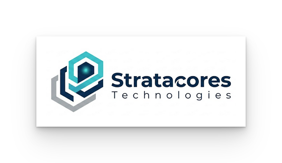
Stratacores Technologies logo must maintain the established themes of reliability, innovation, and global reach while specifically highlighting the meaning of the name: essential multi-layered depth.
This concept will be more minimalist, corporate, and highly scalable, ensuring it performs flawlessly from digital favicons to large-scale physical signage across Canada, the USA, UK, and Australia.
Logo Concept: "The Foundation Strata"
This design shifts from the intertwined 'S' to a stacked, geometric, multi-layered core structure.
1. The Emblem (Visual Symbol)
The emblem is located to the left or top of the company name and is comprised of a singular, stylized, abstract core symbol that appears to be made of distinct, nested, or stacked layers.
The Structure: Imagine a minimalist, stylized cross-section of an infinite core or sphere, but instead of one solid piece, it is formed by three to four concentric, curved, rectangular, or shield-like strata that are separated by micro-negative space.
The Movement: The strata should be subtly angled upward and to the right, conveying forward motion, growth, and optimism. The negative space creates internal "paths" suggesting connectivity and efficiency.
The Scalability: Because the symbol is composed of clean lines and distinct shapes, it can be scaled down significantly and remain recognizable, unlike complex gradients.
2. Color Palette: "Expertise and Trust"
While maintaining the core colors (Deep Blue and Silver), the application is cleaner and more deliberate.
Stratum 1 (Outer/Bottom): Deep Navy Blue (#0A2551). Represents the foundational, trustworthy infrastructure.
Stratum 2 & 3 (Middle): Steel Silver (#A4A9AD). Represents high-tech expertise and modernity.
Stratum 4 (Core/Top): A vibrant, innovative Cyan or Cerulean Blue (#00A9E0). Represents innovation, dynamism, and connectivity.
Background: Crisp white or very light cool grey for a modern corporate look.
3. Typography (Wordmark)
Stratacores: Rendered in a strong, modern, sans-serif typeface (e.g., Montserrat Bold or Poppins), in Deep Navy Blue. The 's' in Stratacores can be subtly stylized—perhaps having the same angled curve as the strata emblem—to link the word to the symbol.
Technologies: In the same font, but lighter weight and all caps (e.g., Montserrat Regular), centered beneath "Stratacores" with wider tracking for airiness.
Why this design works for your needs:
Conveys the Meaning: The nested, angular strata literally depict "Strata" and "Core" without requiring text.
Corporate & Professional: The Deep Navy base and clean lines ensure it looks authoritative.
Modern & Innovative: The addition of a Cyan accent and upward angle provides the "tech-forward" feel.
Highly Scalable: The symbol is a clear, distinct shape, making it ideal for the small-space requirements of digital platforms.
Implementation Mockup for Digital and Physical
Context | Logo Application | Visual Elements |
Website/App Favicon | Minimalist Icon Only | The abstract core emblem, utilizing the gradient from Deep Blue to Cyan. |
Email Signature | Horizontal Logo | Emblem to the left of "Stratacores Technologies." Standard color application. |
Business Cards | Standard stacked logo | Embossed emblem to highlight the "layers." Deep blue and silver color scheme. |
Office Signage | Standalone emblem | A 3D-effect metallic installation where each stratum is a physical layer of polished silver and blue, backlit by innovative blue LEDs. |